Connect With Industry Leading Apps To Level Up Your Business
EVEN MORE VALUE
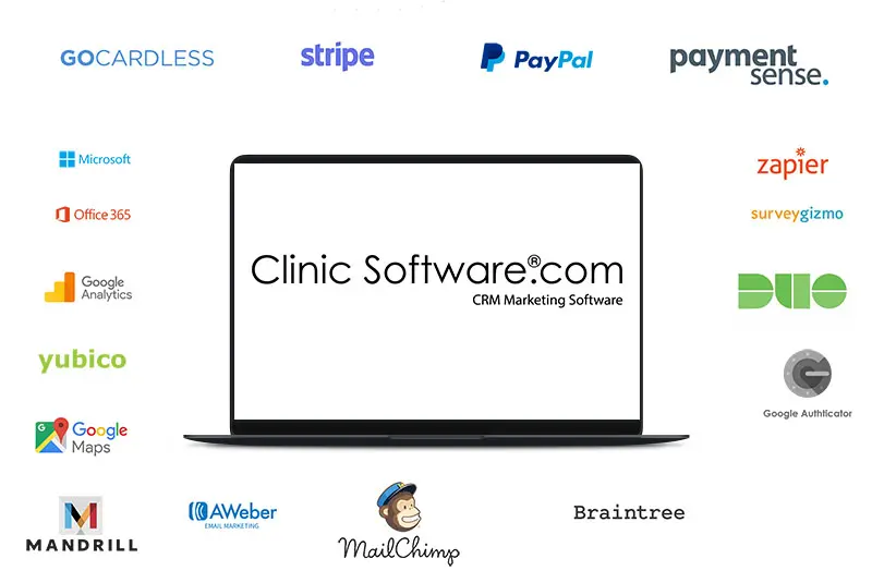
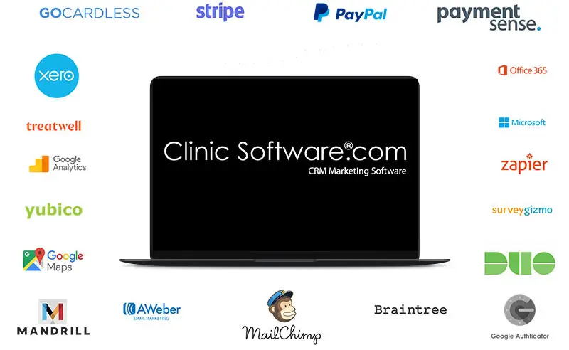
ClinicSoftware.com integrates with lots of web apps you already use (and some great new ones you’ll be thankful you found) to make running your business like never before.


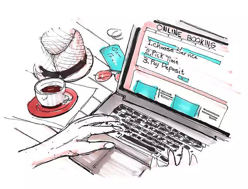
Driving customers to the online booking on your website is a great way to start collecting new appointments from any device on new customers and existing customers.
Thanks to the real-time fully-responsive connection with the software online from anywhere at any time, 24/7/365.
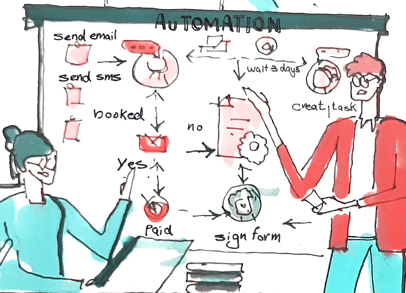
Activating an automation, you in fact power up the business and turn on the engine that moves triggers and actions from step by step until they reach the goal and the end of the sequence. An active automation runs 24/7 until you stop it or delete it.
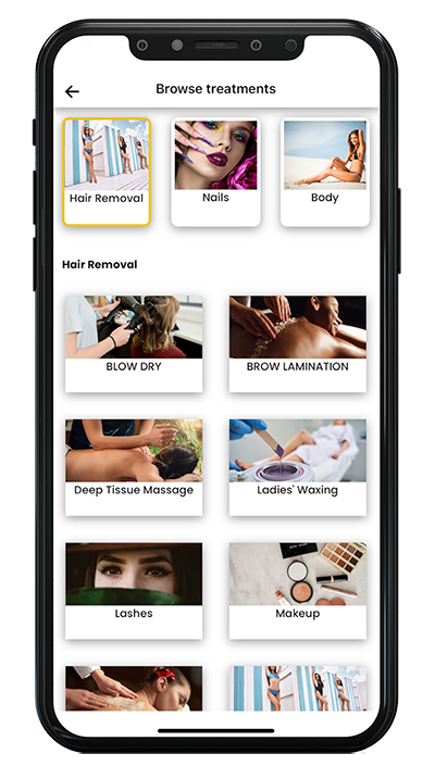
Your business in your pocket. The App allows you to engage and impress customers. ClinicSoftware.com solutions allows you to accomplish this faster by providing the perfect App, so you can focus on creative solutions and open for your business new appointments opportunities.
 Adrian
Proving membership plans makes the clinic services cost-effective for customers also the customer will come in more frequently. The membership plan strategy is among the popular and successful clinics advertising examples.
"In March we had a high increase in inquiries but our consultations were not matching, the moment we started the online bookings with ClinicSoftware.com the consultations just went through the roof. It has literally changed so much. This online booking system is working so well as it is an instant online thing. The functionality is perfect there is nothing to change."
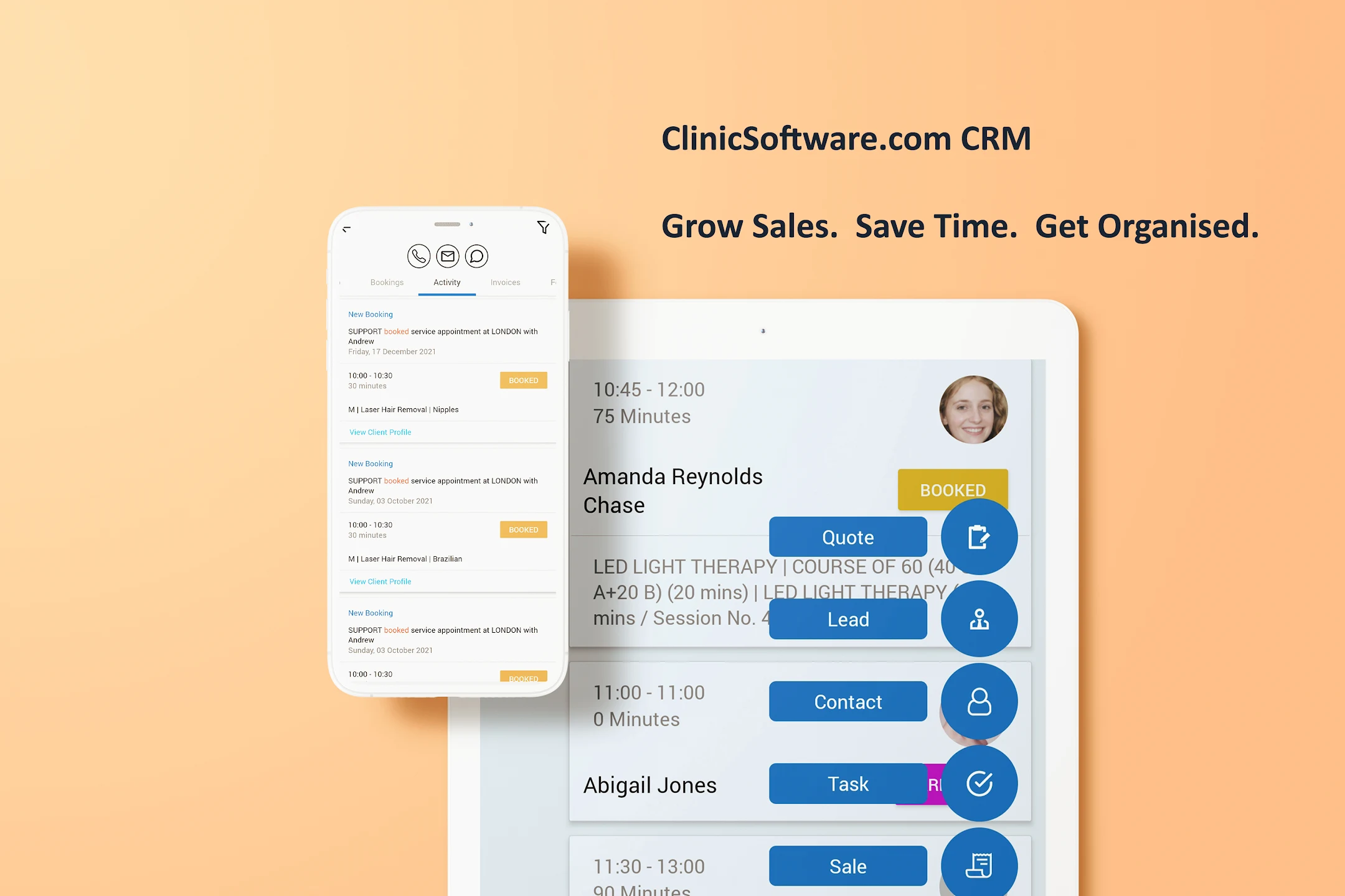
ClinicSoftware.com gives your entire company a 360-degree view of your customers, appointments and facilitates collaboration across your organization, helping you build strong, lasting customer relationships to run and grow your business.
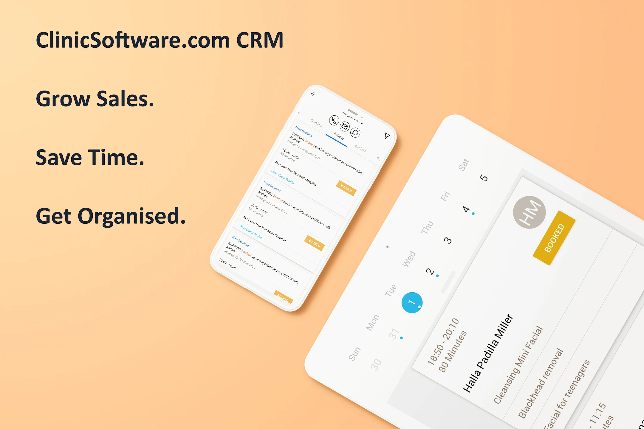
Grow Sales. Save Time. Get Organized.
Keep track of your team and daily tasks, organize multiple tasks, and track important deadlines with Tasks. Create and update your tasks, assign, connect with clients, email and text reminders with notes . Tasks synchronizes across all your company, so your team and tasks are in sync between your team.
Alex
 Dr Hina Sra
"They are by far the most advanced clinic software in the industry. They have great features that are easy to use; not only for your office team but also for our therapists. We also have a mobile application which is really easy to use and it allows clients to make bookings straight from their phone"
The Website is now the primary business driver for nearly every industry. From organic traffic to your website, to paid promotions and banner ads, a company’s reach is virtually limitless and has the ability to grow their sales exponentially by selling products online and taking online appointments and payments from new customers.
Admin
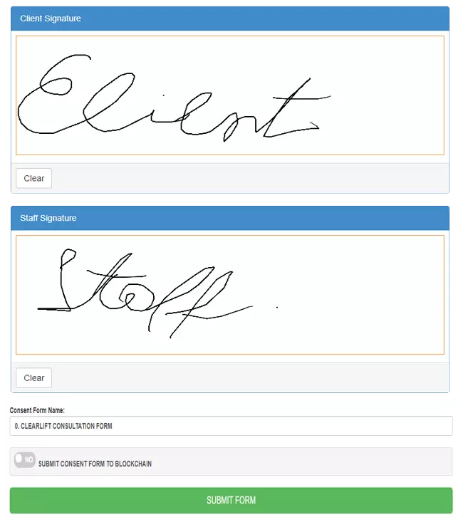
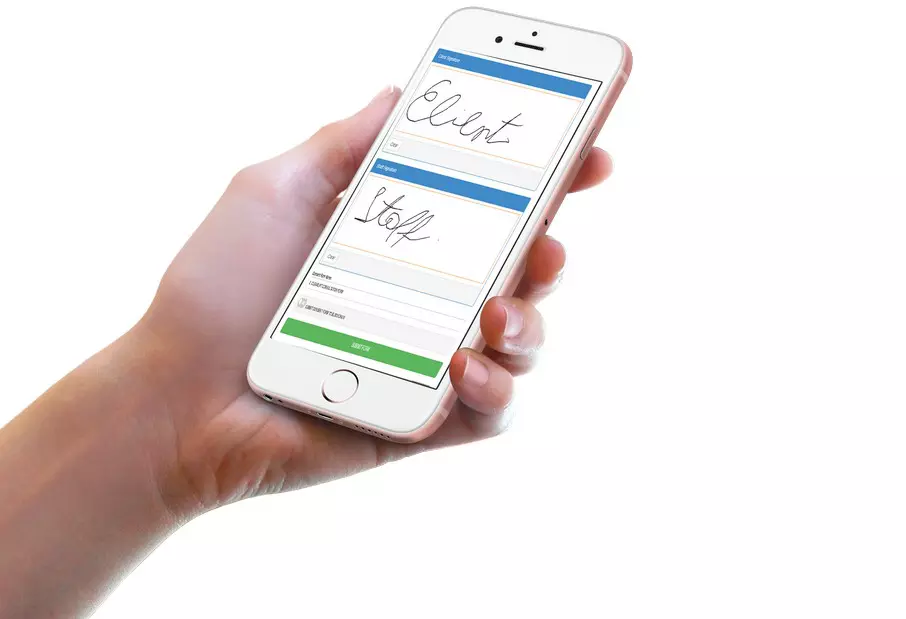
"I'm going to have to go with the iPad features. We just link the iPad straight to the system and the clients can sign with their fingers. There's no paper and no scanning so it's very easy for us."
With the great marketing automation technology we offer to handle much of the organizational grunt work, and tools to keep everything neat, a business can harness its inflow of bookings to start driving business results.
Automated different activities it could save a lot of time to grow your business.
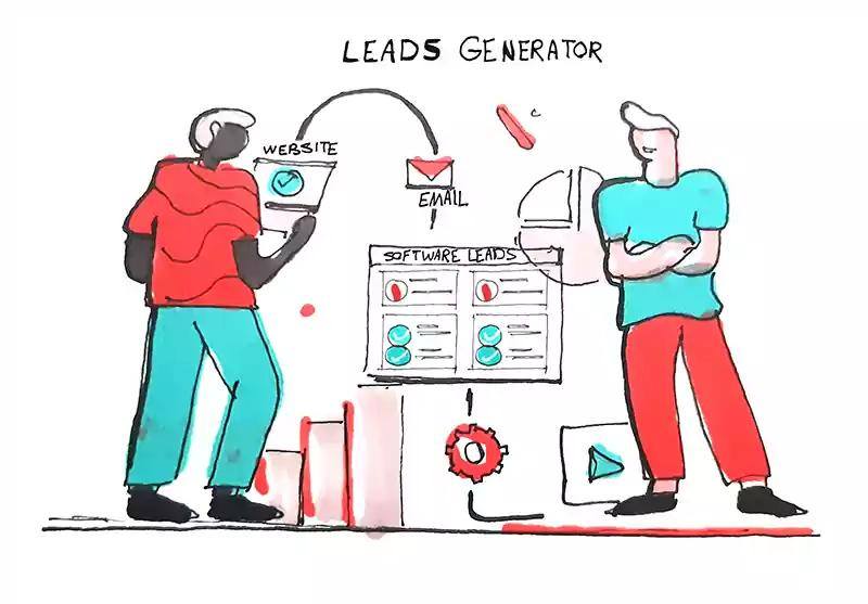
A lead is a person who has indicated interest in your business's services in some way, shape, or form. You can create unlimited forms to attract more leads from your website, social media and blogs. Attract more leads for your business. ATTRACT - CONVERT - CLOSE - REPEAT
Stefan
As you consider Software solutions, it’s important to consider that the modern team, they are always on, always connected, and incredibly mobile. When considering any new tool, including the ClinicSoftware.com, you should make sure the technology enhances this shift in productivity, and fits into your team’s existing work flow.
Admin
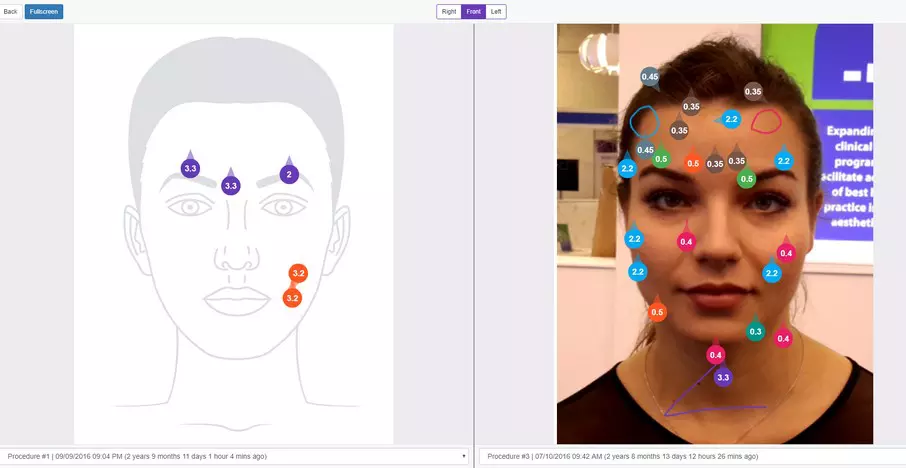
Create simple and intuitive workflows in for your team to follow in order to save more time and get more organised. Using the workflow you can take and insert pictures into the forms, draw inside the forms, generate price quote and tasks in real-time.
 Kanta Jethwani
When you have a custom app, you get lock screen and home screen visibility for your brand. Push notifications are also an effective way to relay news, versus email blasts, because of visibility.
Take a look at your top competitors. Do they have a booking app? Chances are they don’t, since business appointment apps are expensive. Therefore, having your own branded app will provide your clients with one more booking option in comparison to your competitors.
If your client needs to cancel their appointment, but they can’t be bothered to go to your site, sign in and reschedule. They end up leaving it, and you’ve just lost out on 3 hours’ worth of revenue.
If your client needs to cancel their appointment, but they can’t be bothered to go to your site, sign in and reschedule. They end up leaving it, and you’ve just lost out on 3 hours’ worth of revenue.

CS Customer: “ClinicSoftware.com were the only ones willing to adapt to you and the way you function, and the way you wanted your clinic to work, so that makes it special.”
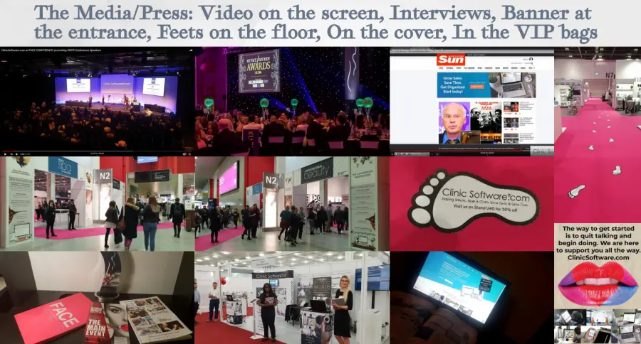
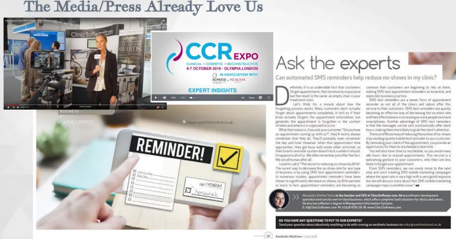
CS Customer: "ClinicSoftware.com is guaranteed to increase your profitability and empowers you to be in complete control of every aspect of your practice." As Seen on: Olympia Beauty Cover, FACE, Aesthetic Journal, Aesthetic Medicine Magazine, Professional Beauty Magazine, CCR, Newspapers.
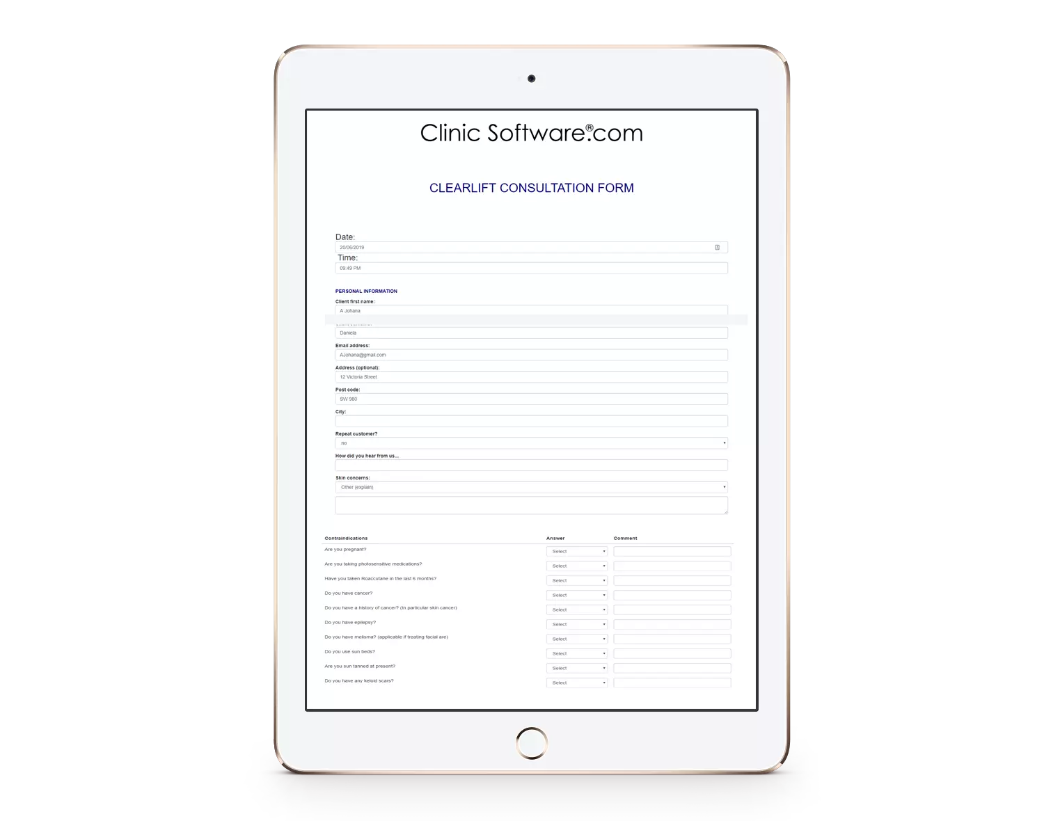
"With the brand-new update you can now do customer appointments on the software! You now have the capacity to change and edit the inquiries within software, save the form away against the customer record card as well as being able to email the form to the relevant people and export in PDF format."
.png)